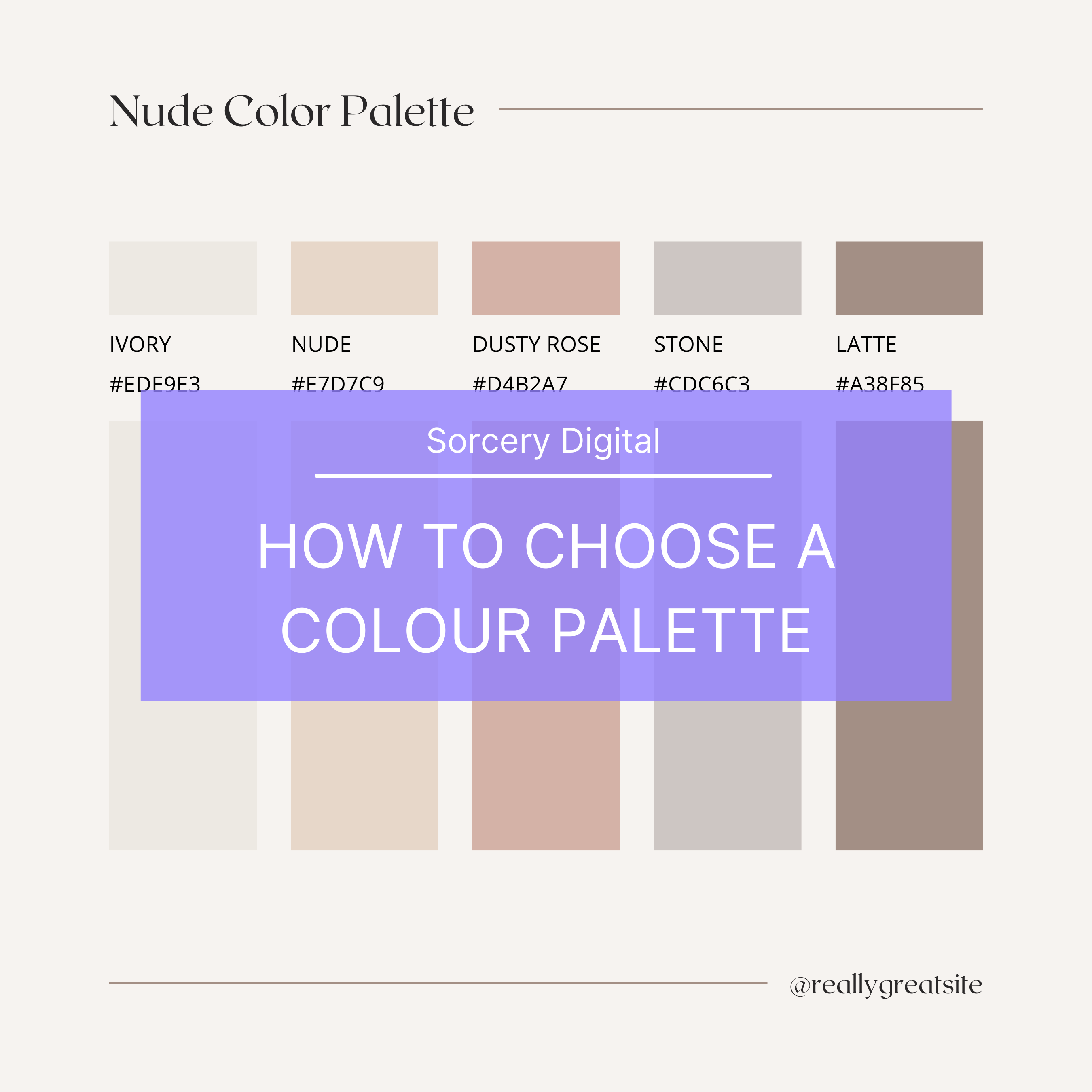
Colour is an important element of any brand identity. However, with infinite shades to choose from, it’s not always easy to feel confident in your decisions.
We’re here to show you how to choose brand colours for your new eCommerce business.
What is a brand colour palette?
Brands are consistently linked with certain shades. Just think about the iconic red of a Coca-Cola can. Just the sight of the light blue box from Tiffany’s can be enough to delight a friend or family member before they’ve even seen what’s inside.
Your brand identity colour palette is your way of creating a beautiful visual experience for your target audience, while also showcasing your brands personality. The right selection of shades don’t just make your marketing materials, website and other branded content more attractive, they also change the way that people interact with your business.
Research shows that up to 85% of consumers believe colour is the biggest motivator when choosing a particular product, while 92% acknowledge visual appearance as the most persuasive marketing factor overall.
Things to consider when choosing you colours.
Understanding what colours represent
Red is associated with danger, excitement, and energy. It’s also known for being the colour of love and passion.
Pink is feminine, it’s sentimental and romantic. Different shades, like hot pink, can be youthful and bold.
Orange, like it’s namesake, is fresh and full of vitality. It’s also creative, adventurous, and associated with being cost-effective.
Yellow is optimistic. It’s a colour associated with being playful and happy.
Green is natural, often used to demonstrate sustainability. But it can also align with prestige and wealth.
Blue is trustworthy and reliable. It’s calming or often associated with depression.
Purple is royalty and majesty. It can be spiritual and mysterious.
Brown is down-to-earth and honest, often used for organic wholesome products.
White is pure. It conveys simplicity and innocence, often with a minimalistic feel.
Black is both sophisticated and elegant. It can be formal and luxurious, but also sorrowful.
Think about your brand in the following ways:
Brand goals: Do you want customers to be happy, to get rich, be more informed?
Target audience: Do you want them to feel positive, confident, or intelligent?
Personality traits: Is your brand fun, serious, or inspirational?
Look at what your competitors are doing, who does it well?
Types Of Colour
Color Hues
This refers to variations of the primary colours: red, yellow, and blue. As you’ll probably recall, these three colours can create any other colour, depending on how they’re mixed.
Color Shade
This is when black is added to a colour, and the amount of shade refers to the amount of black added.
Color Tint
This is the white version of shade, adding white to make the colour lighter.
Colour Saturation or tone
This is when you change a colour’s appearance by adding both black and white.
Colour Codes
There are three colour codes you need to be aware of to ensure your brand colours can be accurately replicated, no matter where they appear. You don’t need to understand these codes completely but you do need to know what your brand colours are in each format, appearing as a series of numbers for each colour.
CMYK and PMS: CMYK stands for Cyan, Magenta, Yellow, and Key (black) while PMS stands for Pantone Matching System. These are used for printing, either off-set digitally.
RGB and HEX: RGB stands for Red, Green, Blue while HEX stands for Hexadecimal Numeral System. These are predominantly found on screens for things like websites and emails.
Where Your Colours Will Be Used
Once you’ve done the research, found your colour, and created a palette of supporting colours, it’s time to put them into action. Across all your touch-points, make sure your selected colours have the desired effect and will work in a variety of ways.
Here are some places where your brand colours can appear:
- Logo
- Website and emails
- Social media
- Advertising
- Instore
- Stationery
- Staff uniforms
- Events
